INTRODUCTION: The digital front door
The property listing page is a vital part of FirstKeyHomes.com. This page provides a gateway for turning a prospect into a resident. Here, they learn if the home is right for their needs, how to take a tour, vital information they need to know, and how to apply it.
THE PROBLEM: Important information is hidden and dropped off
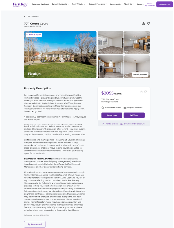
Generated property descriptions pushed property information (bed bath count, square footage, etc.) to the bottom of the page. The page was very sparse, with limited information or actions the user could take.
THE EXECUTION: Designing for the renter
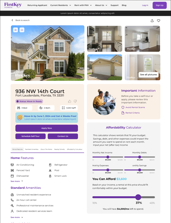
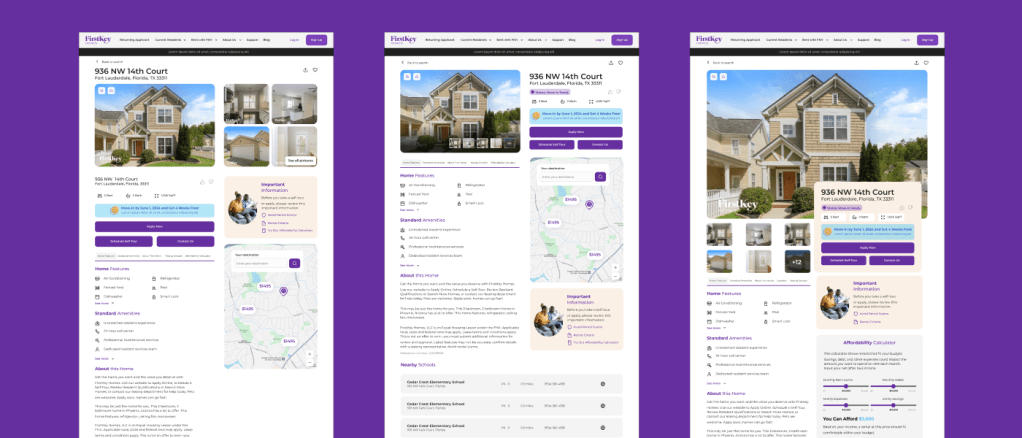
Sectioned vital information (bed, bath, property status, and promotions) near the CTA. Implemented tabbed navigation to compress the amount of scrolling required to review all property information. Added a self-screening section, including rental criteria and an affordability calculator.
THE RESULT: More modern layout
Reduced cognitive load by surfacing vital information above the fold and ensuring users could qualify for the home in a matter of seconds
Leveraging a more modern UI and aligning the property page with our updated brand standards, we’re reinforcing our position in the market as a premium tech-forward property management company, instilling trust in the prospective renters.